Exhibit curated by Kunjika Apurvabhai and Shuxian (Shelly) Liu
This exhibit focuses on food and nutrition behind certain recipes. It builds on our (Shelly and Kunjika’s) interest in food through cultural and nutritional lenses. The way this exhibit is structured is two diagrams adjacent to one another representing the two lenses. On the left side are diagrams of chosen recipes and on the right are diagrams depicting its nutritional value. The purpose of this is to represent two different aspects of food- recipes which help with actual making of the food and understanding the science behind these recipes. Diagrams are first and foremost, useful to someone. With our exhibit, we hope that the usefulness is twofold- in understanding the several nuances of cooking.
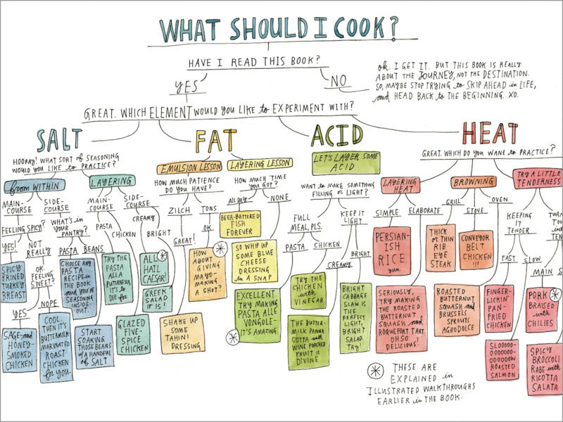
To begin with, a diagram to address the question many of us ask on a regular basis- ‘What Should I Cook?’ This diagram uses arrows, boxes and colors to tackle this question and gives the audience several food options.
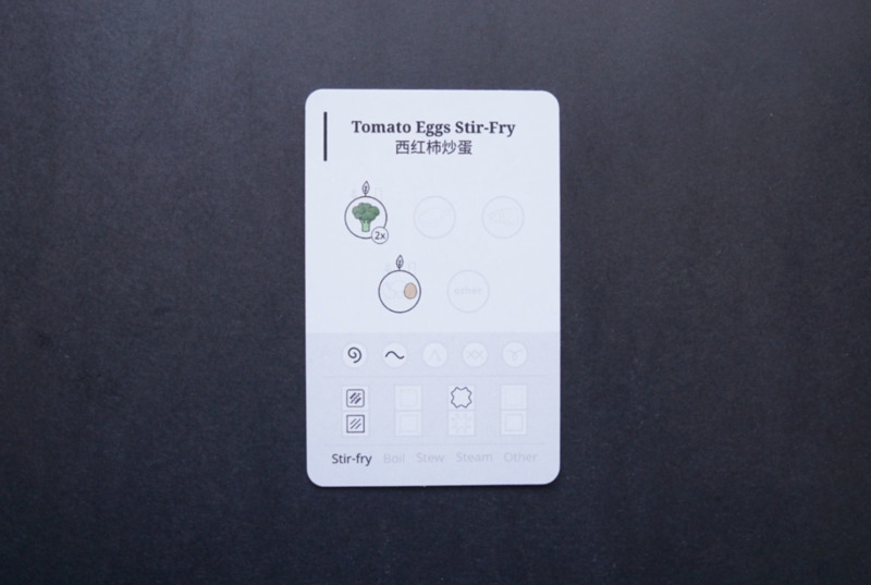
The diagram on the right is taken from Jane Zhang’s project on food that her grandmother made. The larger purpose of this project was to preserve culture through recipes. Zhang expertly combines memory, food and design to iterate her interest in cultural preservation. This diagram depicts veggies and eggs and then indicates that it needs to be made into a stir fry. The several elements in this diagram such as circle, boxes and lines make for easy readability and understanding of it.
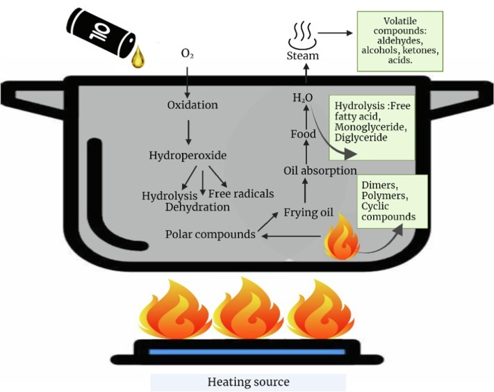
To complement Jane Zhang’s stir fry diagram, we have a diagram on the science of frying. This diagram uses literal imagery to portray frying while using elements such as arrows and boxes to explain the science behind it. It follows the process of frying all the way from pouring oil to creating steam.
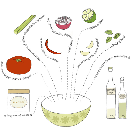
This is a diagram that depicts the recipe of a fresh tomato sauce which could be used in pasta, salad, salsa and more. It uses a simple element- dotted lines, which show the number of ingredients to be combined in the bowl. The words also curve with the ingredients, making it creative and readable.
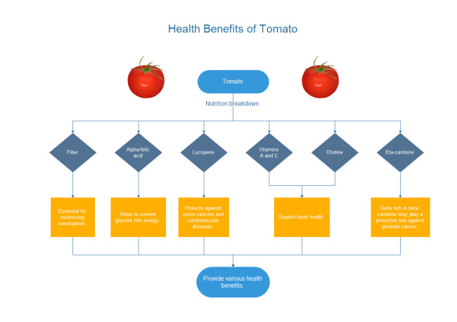
To go along with the tomato sauce recipe, we have benefits of tomato. A nutritional flowchart which explains in detail the several benefitting elements of a tomato. It further breaks it down to how each element supports a different bodily function. The usage of various shapes, colors and lines makes it a useful and interesting diagram.
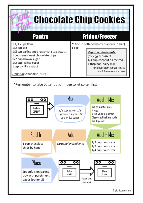
This is a fairly standard recipe of baking a cookie which utilises elements such as arrows and boxes with arrows attached. The arrows are almost protruding out of the boxes doubling as a place to write text and then to add flow to the diagram. It also uses other shapes on ovens, mixing bowl to make the diagram more engaging.
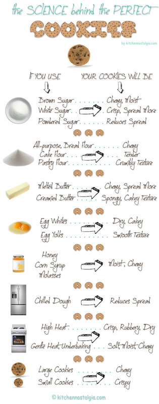
The diagram on the right almost feels like a cheat sheet to baking the perfect cookie. It explains the science of it which could lead to its desired texture and taste- chewy, spongy, dry etc. It uses two arrows to show usage and result in two columns. It’s a simple diagram that makes science digestible and easy to comprehend, ideal for cookie baking beginners.

This espresso guide uses different patterns to explain the different kinds of coffee. It explains the ratio and proportion of water, milk, sweeteners etc using these patterns in a coffee mug. This guide helps individuals make the correct choice for themselves using this diagram. This is one of the only diagrams in our exhibit that does not use arrows.
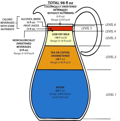
The paired diagram acts as a healthy beverage guideline portraying commonly consumed beverages. On level 2 is coffee or tea, both unsweetened. It is interestingly shaped as a jar of water and uses color to differentiate between the kinds of beverages. Additionally, it uses arrows and lines to outline the its levels and nutritional categories.
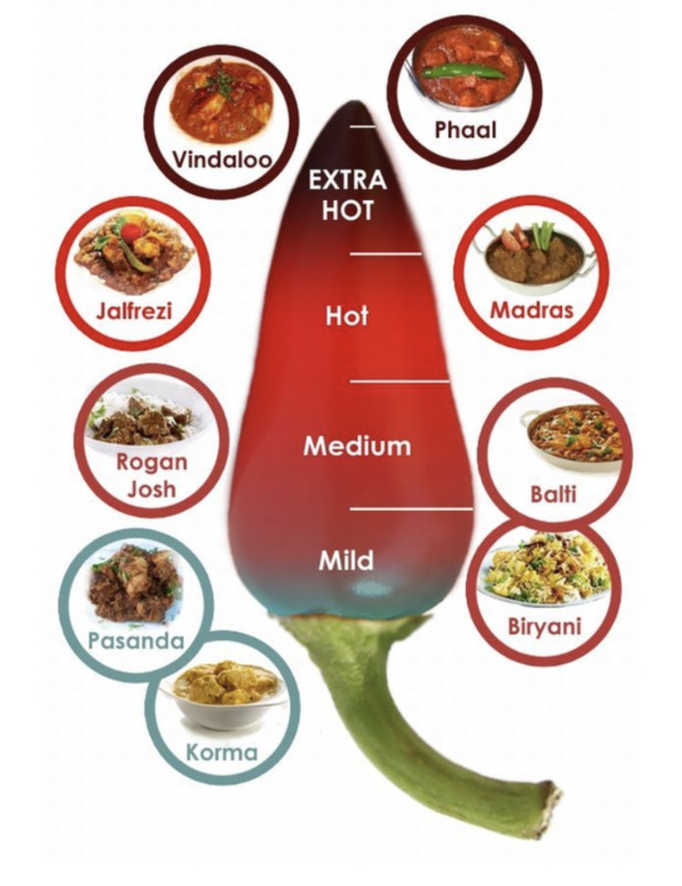
This is a diagram depicting spicy Indian food items. Using the shape of a chili and variations of the color red and blue, it ranks the food in four different levels of spice. The actual food items are in little circles around chili using the same color that corresponds to their spice level. An effective and aesthetically pleasing diagram!
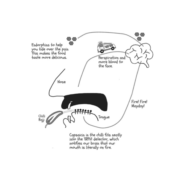
The paired diagram uses a face as the background and its most important framework to portray the science of spicy. Using arrows and dotted lines it makes a connection between the tongue and the brain and the science of spice. In its cyclical flow, it explains eating a spicy food all the way to how it releases endorphins. An effective, spicy flow!
Reference
A huge thank you to Jane Zhang for letting us use her work on her grandmother's food and preserving culture.